Animators Learned the Wrong Lesson From Into the Spider-Verse
Into the Spider-Verse turned American animation toward stylization, but rather than coming up with their own expressive styles, the film's disciples have simply copied its look.
In December 2018, Spider-Man: Into the Spider-Verse sent a jolt through American animation. Releasing between the two Avengers films that climaxed the Marvel Cinematic Universe’s Infinity Saga and marked the peak of the MCU’s dominance over entertainment, Into the Spider-Verse managed to stand out against the throng of superhero films releasing one after another, and against the growing stagnancy of Hollywood’s major animation studios. A principal reason for its success: its electrifying visual style, which infused the film with nonstop energy and burst with creativity, every frame striking and filled with delightful details. The film was an instant classic, gaining critical and commercial success, winning the Oscar for Best Animated Feature, spawning a 2023 sequel that was even more commercially successful, with a planned conclusion to the trilogy slated for 2027. It also became a turning point in animation, as large studios noted the popularity of its expressive style and began following its lead. Unfortunately, they learned the wrong lesson. For instead of prompting the development of new explosive animation styles suited to their projects, the success of Into the Spider-Verse has given us more films that look like Into the Spider-Verse.
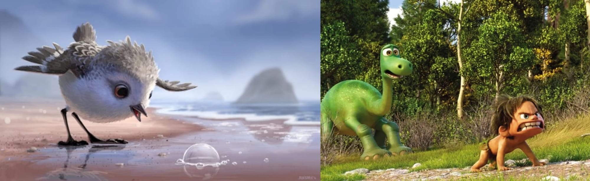
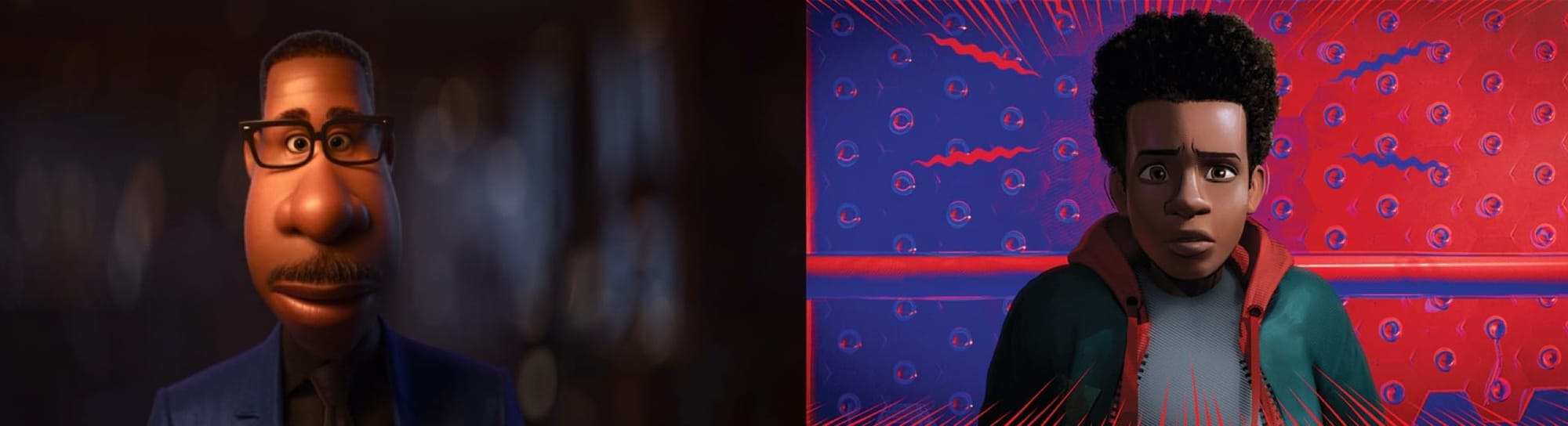
The impact of Into the Spider-Verse’s style was largely due to its contrast with the dominant style of American animation at the time, a style that had been maturing ever since it arrived in theaters in 1995 with Pixar’s first feature, Toy Story. The first ever fully computer-animated feature film, it made toys its main characters because human faces were still challenging to animate on a computer, and having its characters literally be made of plastic would be more believable. But computer animation rapidly progressed. In 2001, Pixar tackled the challenge of animating fur with Monsters, Inc. In 2003, they mastered water with Finding Nemo. In 2004, they finally made a film focused on human characters with The Incredibles. By the mid-2010s, computer animation had grown remarkably advanced, to the point that it was often indistinguishable from live-action footage. Combined with ongoing advancements in visual effects and performance capture technology (most notably in the Planet of the Apes films starring Andy Serkis), the word of the day in animation was photorealism. And while the achievements of this movement are undeniably impressive, the success of photorealistic animation brought in its own issues. In films like The Good Dinosaur, cartoonish character designs clashed with environments that looked like they came straight out of a nature documentary. What if we scrapped those cartoonish designs and made the characters photorealistic as well? Then we end up with the 2019 Lion King remake, which robs the characters of all their expressiveness in service of a realism that does not do anything for the film. By the end of the 2010s, it was becoming clear that photorealism for photorealism’s sake was not a worthy goal.
Enter Into the Spider-Verse, a film that had no desire to appear realistic and instead opted for a hyper-stylized, expressive style. That style blew the doors off the animation industry, and in the six-plus years since, expressiveness has replaced realism as the trend in animation as each studio tries to replicate Into the Spider-Verse’s kinetic style. But what does this style actually consist of? Beyond the vague descriptors of “stylized” and “expressive,” what were the key choices that created the visual identity of Into the Spider-Verse?
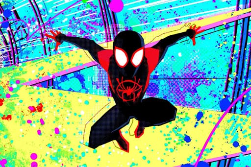
The main principle guiding this style is the move to accentuate, rather than hide, the presence of an animator, to give the visuals a more “handmade” feel. One of the most notable ways this is done is through larger, more visible “brush strokes.” The “strokes” are of course made with digital tools rather than physical pens and paintbrushes, but the concept is the same. Rather than blending colors together to create a single, smooth surface, we are more able to see each individual line drawn. Each patch of color has its own visible brush texture. One notable difference between the realistic Pixar style and the expressive Spider-Verse style is in the animation of shadow. Where photorealistic animations painstakingly trace every detail of light falling across a face, using smooth gradients to transition between various shades, between light and shadow, the Spider-Verse style uses sharper lines to create a more explicit contrast between the light and dark areas of a face. Finally, instead of using naturalistic backgrounds to depict an environment, the Spider-Verse style often opts for more abstract, expressionistic backgrounds, infusing them with cool neon colors – pinks, purples, and blues – that bleed throughout the frame. The transition between these two styles of animation is somewhat akin to the movement from impressionism to fauvism in painting at the turn of the 20th century.
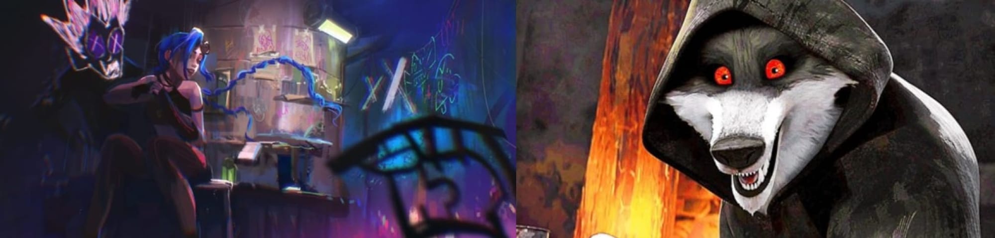
It is this style specifically, the Spider-Verse style, that is steadily gaining prominence in American animation. Among the most notable projects to feature it are the television series Arcane and the DreamWorks features Puss in Boots: The Last Wish and The Wild Robot. These projects are all high-quality and look very good, but in more or less adapting Into the Spider-Verse’s exact style of animation, they leave something on the table. The animation of the Spider-Verse films is breathtaking not necessarily because its style is inherently the best, but because it is the best choice for these films specifically. Yet the Spider-Verse disciples focus their energies on the visual style itself, instead of considering the more fundamental design choices that led to that style, and which could lead to the development of a new style perfectly suited for their own film.
The style of Into the Spider-Verse was chosen not just because it looked good, not just for the purpose of being stylish and expressive, but for a very specific end: to replicate the feeling of reading a comic book. The character designs and compositions are modeled after the ones used in comics, where the small size of individual panels leads to a prioritization of clear and striking iconography over nuance and detail. Sequences are designed around key poses and emphasized images rather than fluid motion to replicate the discrete images of comics, especially their splash pages. Captions and onomatopoeia appear on screen and if you look closely at the frame, you’ll even find the Ben-Day dots that populate most comic books. Most indicative of Spider-Verse’s style following from its concept is the fact that the films actually contain several styles corresponding to the various dimensions they include. Peni Parker is drawn in an anime style, Spider-Ham’s style recreates that of Looney Tunes. In Across the Spider-Verse, we actually travel to other dimensions and are engulfed in entirely new styles. Mumbattan, the home of Spider-Man India, is based on the Indian Indrajal comics, while Gwen Stacy’s dimension is done in watercolor, reflecting her melancholy emotional state. In the Spider-Verse films, the style is not the endgame. It is a tool deployed specifically to meet a much deeper goal regarding how the film should feel.
When this style is then transplanted into projects that are not specifically focused on adapting multiversal Spider-Man comics, something is lost. The visuals of the Spider-Verse disciples look nice, but they lack the specificity of vision that the Spider-Verse films have. They do not sport styles specifically designed to the particular story they want to tell. Here there are great missed opportunities. Puss in Boots: The Last Wish is a film that announces itself up front as a fairy tale, trading in the irony of the Shrek franchise it was born from for sincerity and sentimentality. What sorts of visual styles could it use to play into that newly declared identity? How might it incorporate fairy tale iconography into the principles of its animation? Arcane is (very loosely) based on the video game League of Legends. Is there some visual signature in playing the game that it can adapt into its animation? Full disclosure, I’ve never played League of Legends, and from what I understand the show is a great deal distanced from the game to begin with, so perhaps replicating the game’s experience was never the intention. But even so, there is plenty of room for the show to use its animation to distinguish the kind of world and story it is depicting.
By and large, the Spider-Verse-induced shift from realism to stylization in American animation is a net positive. The photorealism movement had worn its course, and even when deployed without pointed intention the new expressive style is still pleasing to look at. The works that take up Into the Spider-Verse’s style are probably more visually interesting than they would be if still striving for realism. But there is so much potential left untapped in expressive animation by just recycling this new style. Into the Spider-Verse’s animation was not so effective because of the specific style it used, but because the filmmakers engineered the perfect style for their film. The lesson learned from Into the Spider-Verse’s success should have been that animation is most effective when its style is designed around the project it serves rather than used as an end in itself. If animators were to learn that lesson, they would achieve something far better than regurgitating a successful style: creating their own, new, explosive style that pairs perfectly with their film. A style that, inevitably, everybody else would then want to copy.